wow francis~ helloh helloh~ thanks for the compliment... your lil' logo picture is scary...so the opposite of you. that expression is what i felt like the whole time i was preparing my portfolio. YIKES. one more week and i will be done. yippeeeeeeeeeeeeeeeeeeeeeeeeee!!!


8 comments:
trully this green color is the best for your blog. I believe.. even your Blog title supports it.. ~!!!^^
kkk...my favorite color greeen~
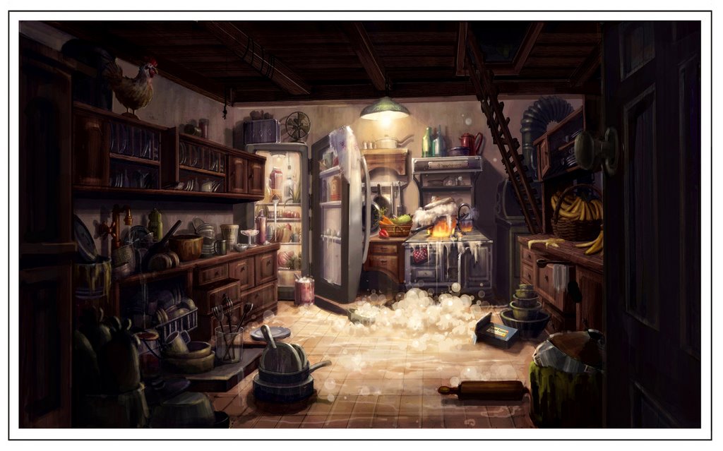
WOW.... WOW I love the way you apporach to the final painting..
the process is really fantastic~!
Yeah this piece is excellent! Nice lighting and texture.
wow francis~ helloh helloh~
thanks for the compliment...
your lil' logo picture is
scary...so the opposite of you. that expression is what i felt like the whole time i was
preparing my portfolio. YIKES.
one more week and i will be done.
yippeeeeeeeeeeeeeeeeeeeeeeeeee!!!
I just love people who can do fantastic environment pics,and you're someone who does stunning work !!
Again great detail very nice!!
this is my favorite ilustration from your blog, the color and mood are Gresat!
Post a Comment